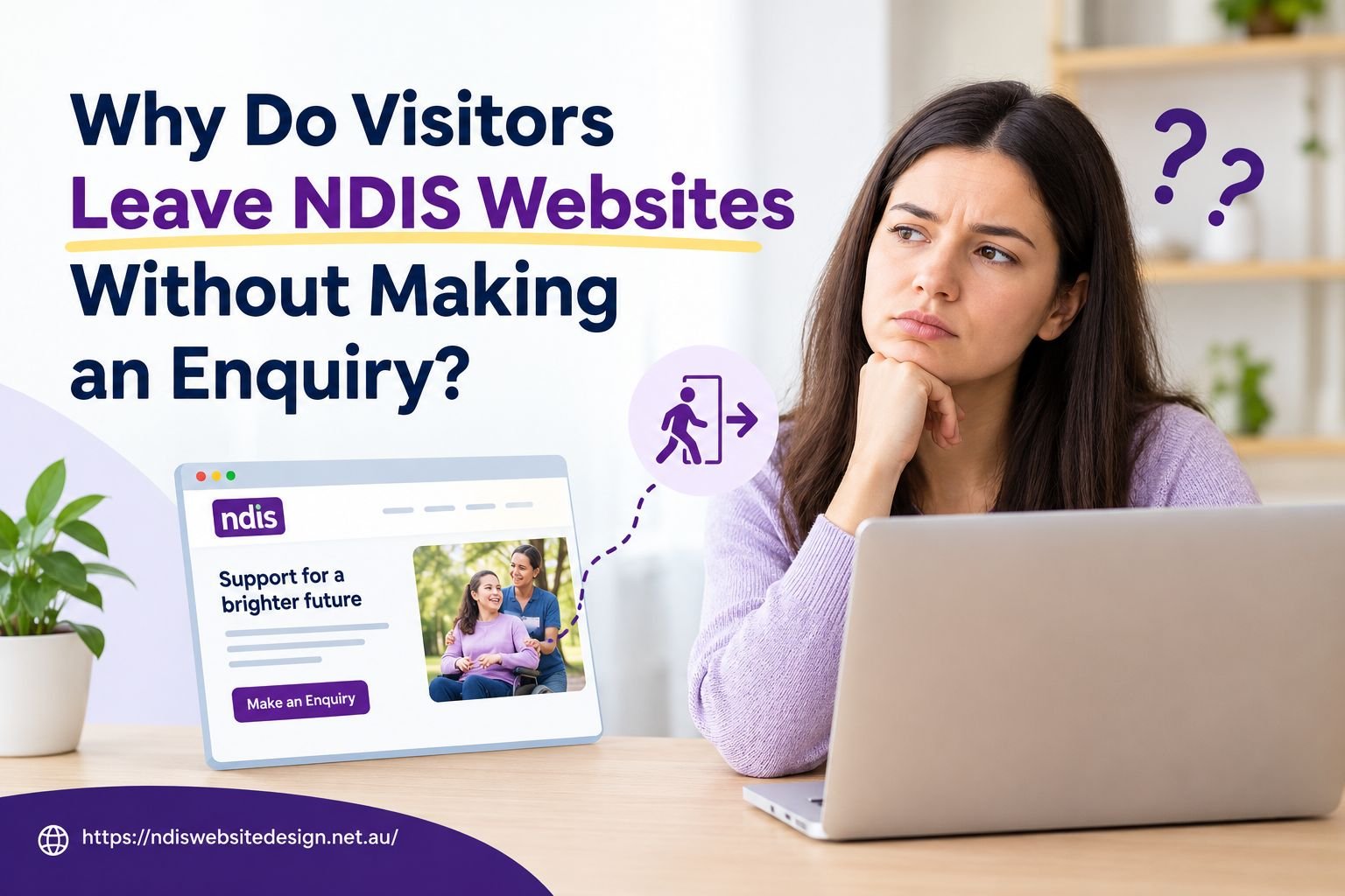
When someone looks for disability support, a provider’s website is often the first place they visit. Participants, families and carers use it to understand what services are offered, whether the provider works in their area and how to get in touch. If the website does not answer these questions quickly, many visitors leave without sending an enquiry.
For an NDIS provider, each lost enquiry is a missed chance to support someone. This blog explains eight common reasons visitors leave and the practical steps that can help. Some providers make these updates in-house, while others work with an NDIS website design agency. Either way, the aim is the same: a website that is clear, accessible and easy to use.
1. Service Information Is Unclear or Too Short
Participants and families need clear information before they contact a provider. A page that only lists service names, such as “community participation”, does not explain what the support involves.
Each service page should cover four points:
- What you offer: the support you provide
- Who it suits: the needs your service can address
- Where you work: the suburbs or areas you cover
- How to get started: how to ask a question or make an enquiry
To have an effective NDIS Website Development Service, you must first have clear content. For example, rather than indicating a service name alone, clear content such as “We support you to join local groups, visit community spaces and take part in activities” gives the website visitor a better idea of what the service entails. Clear content is the foundation of any good website design, especially for the NDIS.
2. Content Focuses on Services, Not Participant Needs
A list of services shows what you do, but it does not always show how you can help. Website content should answer the questions visitors are likely to have.
| Visitor’s question | What the page should explain |
| “Can I get support at home?” | The types of in-home support you offer |
| “Do you cover my suburb?” | Your service areas and any limits |
| “Can I speak to someone first?” | How to contact your team |
Avoid making claims like your service suits everyone. Instead, state what you offer and invite visitors to discuss their specific needs with you. This approach is central to custom NDIS website design, where the content and layout of the site are planned around the participants and their families instead of a generic template.
3. Navigation Is Confusing
Visitors should be able to find key details, such as a phone number or service list, within a few clicks. Long menus, unclear labels and large blocks of text make this harder.
Keep the main menu short and use clear labels: Our Services, About Us, Service Areas and Contact Us. Use headings to divide long pages and add links to related services.
Custom NDIS website design allows menus and page structure to follow the way visitors actually search for information.
4. Trust Information Is Missing
Choosing a support provider is a personal decision. Visitors often want to know who they will be dealing with and how the provider respects their choices.
Helpful trust details include:
- Team roles and experience
- Your values and approach to support
- How you protect participant choice and privacy
- The areas you cover
- Genuine reviews shared with permission
- Registration details, where relevant
Only use actual photographs when you have obtained proper authorization to display them. Evidence-based support enables you to prove which service provider stands as the best choice. People tend to trust verified information more than they would trust forceful statements.
The successful operation of NDIS websites depends on their ability to function as marketing tools that fulfill their operational needs. The design reveals your service through straightforward presentation while marketing strategies direct appropriate customers to discover your service.
5. Accessibility Barriers Block Visitors
A disability support website should be usable by the people it serves. Some visitors use screen readers, some move around by keyboard and others need larger text or stronger colour contrast.
The Web Content Accessibility Guidelines (WCAG) set the standard for accessible web content. The NDIA has said it is working towards meeting WCAG 2.2 at level AA on its own website.
Key areas to review:
- Text and contrast: easy to read against the background
- Images: short descriptions (alt text) for useful images
- Forms: clear labels and simple error messages
- Keyboard access: menus, links and forms that work without a mouse
- Videos: captions for people who cannot hear the audio
Automated checks for accessibility on your NDIS provider website are useful. However, testing your site with real users and different devices gives you a fuller picture. The best web design for NDIS providers treats accessibility as a core requirement, not an extra.
6. The Contact Form Asks for Too Much
A long form with many required fields can discourage enquiries. Visitors may not want to share personal details before speaking with someone.
A good enquiry form asks only for a name, a preferred contact method and a short message. Mark optional fields clearly and avoid asking for health information. Explain what happens next, including who will reply and how.
Also display a phone number and email address for people who prefer not to use a form. NDIS Web Design Solutions should treat the enquiry form as part of the visitor’s journey, not a last step.
Always send a test enquiry to confirm it reaches the right inbox. A form that fails to send can mean lost enquiries without anyone noticing.
7. The Next Step Is Not Clear
Visitors may be interested in your service but still leave if they do not know what to do next. A button labelled “Submit” gives little guidance.
Use clear, action-based wording such as:
- Ask About Our Services
- Talk to Our Team
- Request a Call Back
- Check Our Service Areas
Place these buttons near the relevant information. For example, an in-home support page should include a link to ask about in-home support. Strong NDIS website designs and marketing keep each page focused on one clear action and each button should do what it says.
8. The Website Is Slow or Hard to Use on a Phone
Many visitors browse on a phone. Small text, overlapping buttons, long forms and slow pages can all lead to people leaving.
Test your website on a phone. Read a service page, use the menu and complete the enquiry form. Check for:
- Pages that load slowly
- Text that needs zooming to read
- Buttons that are hard to tap
- Forms that do not fit the screen
Google PageSpeed Insights is a free tool that checks page speed. An experienced NDIS website design agency will test mobile performance from the start of a project.
Where Should You Start?
A full redesign is not always needed. Begin with one important page, such as your main services page and review it using this table.
| What to review | What to look for |
| Service pages | Missing details or unclear terms |
| Contact page | Hard-to-find details or a long form |
| Mobile view | Text, buttons or menus that are hard to use |
| Website data | Pages where many visitors leave |
| Feedback | Questions raised by participants and families |
Google Analytics can show where visitors leave your site and Google Search Console shows which searches bring people to it. These tools show patterns, not reasons, so combine them with feedback from participants and families. For providers who need extra support, NDIS Web Design Solutions can help with planning, updates and ongoing checks.
Final Thoughts
Visitors who leave your website have not always rejected your service. They may simply have struggled to find answers or a way to get in touch.
Clear service details, honest trust information, accessible design and a simple enquiry process can remove these barriers. Each improvement helps participants, families and carers take the next step with confidence.
At NDIS Website Design, we are an NDIS website design agency that builds clear, accessible websites. Our website development services support you from planning to launch. The best web design for NDIS providers helps people find answers easily.
Contact us today to get started.
Frequently Asked Questions
1. Why do visitors leave an NDIS provider website without making an enquiry?6
Visitors leave websites for a variety of reasons, but some of the most common are when the information is unclear or hard to find and the website is slow on mobile devices. Ensuring that the website contains clear, simple information will help to keep visitors on the website.
2. What should an NDIS service page include?
Each service page should include information about the type of services the provider offers, the participants that benefit from those services, the location of the provider and how participants can get started. This information should be written in plain, everyday language to ensure that all visitors can understand the content.
3. Does an NDIS provider website need to be accessible?
Yes. An accessible website is beneficial for all visitors to the website, including those with disabilities that may require screen readers or keyboard-only navigation. Following the WCAG guidelines to ensure that the website has appropriate text contrast, image descriptions, form labels and video captions will help to make the website accessible to all visitors.
4. How can I find out why people leave my website?
Reviewing the website on a phone, testing the website’s contact form, reviewing Google Analytics data and adding feedback from NDIS participants and their families are all methods that a website owner can use to find out why people leave their website.