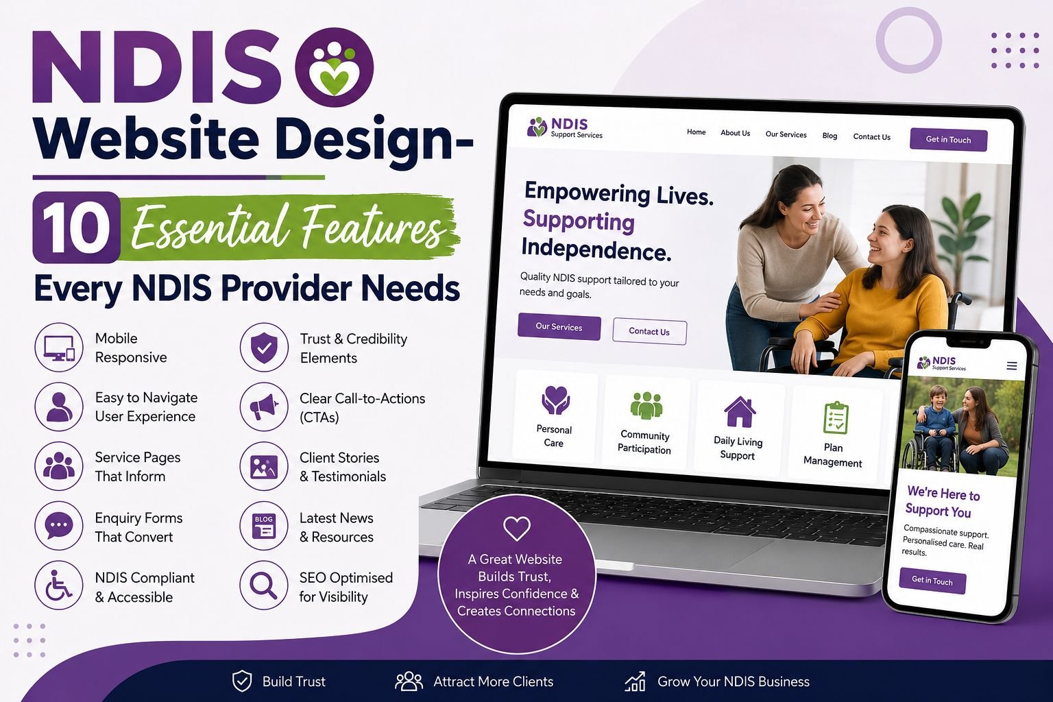
A strong provider website must do more than look clean. It must guide people, reduce stress and help visitors understand services fast. Many participants, families, carers and support coordinators arrive with questions before they make contact. Good structure answers those questions, builds trust and invites action without pressure. NDIS website design works best when it blends access, clarity, service detail and search visibility.
This guide explains ten features every provider needs to create a site that feels useful, respectful and simple from the first click, without confusing visitors or slowing their next step.
1. Accessible Design That Welcomes Every Visitor
A good website should be easy for everyone to use. This may sound simple, but it needs careful planning.
Some visitors may use screen readers. Others may use a keyboard instead of a mouse. Some people may need larger text, clear colour contrast, captions or simple instructions. When a website does not support these needs, visitors may leave before they understand how your services can help.
That is why NDIS website accessibility should be part of the website from the beginning, not something added later.
What Accessibility Should Include
- Clear headings
- Easy-to-read text
- Strong colour contrast
- Image alt text
- Keyboard-friendly menus
- Clear form labels
- Captions for videos
An accessible NDIS website helps participants, families and support coordinators move through your site with less stress and more confidence.
2. Clear Service Pages That Answer Real Questions
Visitors should not have to guess what you offer. They should understand your services within a few moments of landing on your website.
Your NDIS service pages should explain each support in simple language. Tell visitors what the service includes, who it is for, where it is available and how they can get started.
For example, instead of only listing “Community Participation”, explain what it means in daily life. Can you help someone join local activities, build confidence, attend social groups or learn new routines?
This is where NDIS website design becomes more than layout. It becomes a helpful guide that supports better decisions.
3. Simple Navigation That Feels Natural
Your website menu should work like a clear signpost. It should help visitors find the right page without effort.
If people cannot find what they need, they may leave and choose another provider. So, use simple menu labels such as “Services”, “Locations”, “Referrals”, “About” and “Contact”.
Avoid unclear labels or creative wording that may confuse visitors. Your website should make the journey simple, not make people work harder.
A Strong Menu Helps People Find
- Your main services
- Areas you support
- Referral options
- Contact details
- Helpful resources
Good NDIS web design keeps the visitor journey smooth and helps people move from one page to the next with ease.
4. Mobile-Friendly Pages That Work on Every Screen
Many people search for providers on their phones. They may be at home, at work, in a meeting or helping someone else find support.
Because of this, your website should look clean and work well on mobile devices. Text should be easy to read. Buttons should be simple to tap. Forms should feel short, clear and easy to complete.
A mobile-friendly website also helps people contact you when they are ready. If visitors need to zoom, scroll too much or struggle with a form, they may leave before making an enquiry.
5. Trust Signals That Help People Feel Comfortable
Trust grows through proof. Visitors want to know who you are, what you stand for and whether your service feels right for them. Your website should answer those concerns before the contact form.
Useful trust signals include team profiles, values, qualifications, service approach, safeguarding information and participant stories.
NDIS website compliance also matters here. Providers should present information with care and ensure their website reflects relevant obligations, privacy needs and safe communication practices.
6. A Referral Pathway That Makes Life Easier
Support coordinators often visit websites with one clear goal: to find out whether a provider can help a participant.
So, do not make them search for answers. A clear NDIS referral form can make the process easier for everyone. Keep it short, simple and practical.
Ask for the details your team needs, but avoid making the first step feel too long or difficult.
A Helpful Referral Form May Ask For
- Participant name
- Contact person
- Service needed
- Location
- Preferred contact method
- Consent confirmation
- Extra notes
When the referral pathway feels simple, more people are likely to use it.
7. Contact Options That Encourage Enquiries
Different people prefer different ways to contact a provider. Some may want to call. Others may prefer a form. Some may choose to email first.
For this reason, your website should offer clear contact options across key pages. Add contact buttons on service pages, location pages and referral sections so visitors do not have to search for the next step.
NDIS participant enquiries often begin when a visitor feels ready. So, use clear and friendly calls to action. Instead of only using “Submit”, try wording such as “Ask about this service” or “Send an enquiry”.
Small wording changes can make the contact process feel warmer and easier.
8. Local SEO That Helps the Right People Find You
Many people search for support near where they live. So, your website should clearly show the areas you serve.
Local SEO for NDIS providers helps your website appear for location-based searches. You can support this with clear service-area content, location pages and internal links between your services and suburbs.
NDIS website SEO also includes page titles, meta descriptions, headings, image text and useful content. These elements help search engines understand your website and help visitors reach the right page.
9. Helpful Content That Builds Confidence
Good content can turn confusion into confidence. It helps visitors understand your services before they contact you.
Your website can explain what happens after an enquiry, how referrals work, what information to prepare and how each support may help in daily life.
Helpful content may include guides, FAQs, checklists and service explainers. These resources support SEO for NDIS providers while helping visitors make informed decisions.
Use clear language, short sections and simple explanations. Your website should help people feel guided, not lost.
10. A Strong Technical Base That Supports Growth
Even a well-designed website can fail if it loads slowly, breaks often or sends enquiries to the wrong place.
That is why your website needs a strong technical base. Pages should load fast. Forms should work. Security should stay updated. Service information should remain current.
You should also track how people use your website. This helps you see which pages bring enquiries and where visitors may leave.
A strong NDIS provider website is not something you build once and forget. It needs regular care so it keeps working for your team and the people you support.
How These Features Work Together
Each of these features is important on its own, but the best results come when they work together. Accessibility ensures that all users can use your website with ease. Service pages allow you to explain what you offer. Navigation allows visitors to find the right information. Trust signals build confidence in your company and forms and contact options make it easy for users to enquire about your services.
Search is also one of the ways in which the right people can find your website. This is one of the reasons why the design of your NDIS provider website should focus on the user first and foremost. When your website is clear and easy to use for your visitors, they will be more likely to stay on your website and to contact your team.
Conclusion
A provider website should feel clear, human and easy to use. It should welcome participants, support families, guide coordinators and help your team receive better enquiries. The ten features above create a practical base for access, trust, search and conversion.
NDIS website design is not just a visual project. It is a service pathway that starts online. When each page has a purpose and each action feels simple, your website can support growth while respecting the people who need your help and the choices they make across every stage of care.
Want Your Website to Work Better for Your NDIS Business?
Your website should do more than just exist online. It should help visitors find information, understand your services and contact you with confidence. At NDIS Website Design, we build simple, accessible and search-friendly websites that help providers connect with participants, families and support coordinators.
FAQs
What makes a good provider website?
A good provider website explains services, locations, referral steps, access options and contact details with clarity. It helps participants, families, carers and coordinators act without confusion, pressure, delay or stress.
Why does accessibility matter for providers?
Accessibility is important since different participants employ various tools and devices and have diverse reading needs. It ensures better structuring, good contrast, labeling, captioning, keyboard accessibility and clear content.
How can a website attract more enquiries?
A website attracts enquiries through clear service pages, visible contact options, useful location content, short forms, trust signals and helpful answers that match participant search needs and local intent well.
Should providers focus on SEO or design first?
Providers should plan both together. Design shapes trust and access, while search brings visitors. The best result comes when structure, content, speed and usability connect as one clear online pathway.